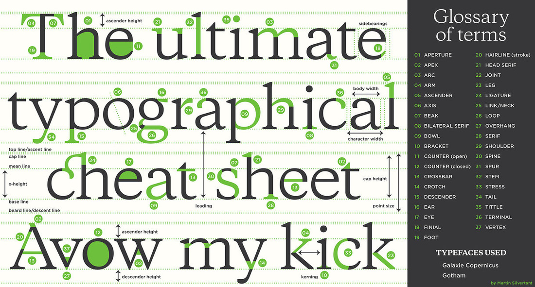
Distinguish the difference between a serif typeface and san serif typeface.
Serifs are semi-structural details or small decorative flourishes on the ends of some of the strokes that make up letters and symbols. An example would be the Times New Roman font. Sans serif does not have these details or flourishes.
Identify a specific typeface that should be used for print versus one that should be used for the monitor.
Explain why Johannes Gutenberg and the printing press were important to today’s society.
Without his invention society wouldn't have developed in the way it has today. such as magazines and newspapers and then on to phone calls and more important things.
Identify which resolution you would use for web and which you would use for print.
You would use a 300 resolution for printing and a lower resolution for web.
Identify which file extensions relate to which software programs (.psd, .ai, .png, etc.)
PSD is saved from photoshop. AL is something saved from illustrator and a PNG is a screen shot of something. There is also a JPEG which is something saved and not yet turned in to a screen shot.
Explain how you create a screenshot on a mac.
Command shift 4.
Identify the type of file that is created from a screenshot.
When you take a screen shot your left with a png. file.
List and provide examples of the elements and principles of design.
LINE
Line can be considered in two ways. The linear marks made with a pen or brush or the edge created when two shapes meet.
SHAPE
A shape is a self contained defined area of geometric or organic form. A positive shape in a painting automatically creates a negative shape.
DIRECTION
All lines have direction - Horizontal, Vertical or Oblique. Horizontal suggests calmness, stability and tranquillity. Vertical gives a feeling of balance, formality and alertness. Oblique suggests movement and action.
SIZE
Size is simply the relationship of the area occupied by one shape to that of another.
TEXTURE
Texture is the surface quality of a shape - rough, smooth, soft hard glossy etc. Texture can be physical (tactile) or visual.
COLOUR
Also called Hue.
VALUE
Value is the lightness or darkness of a colour. Value is also called Tone.
BALANCE
Balance in design is similar to balance in physics.
Explain the concept behind a critique.
Identify the essentials needed in a critique.
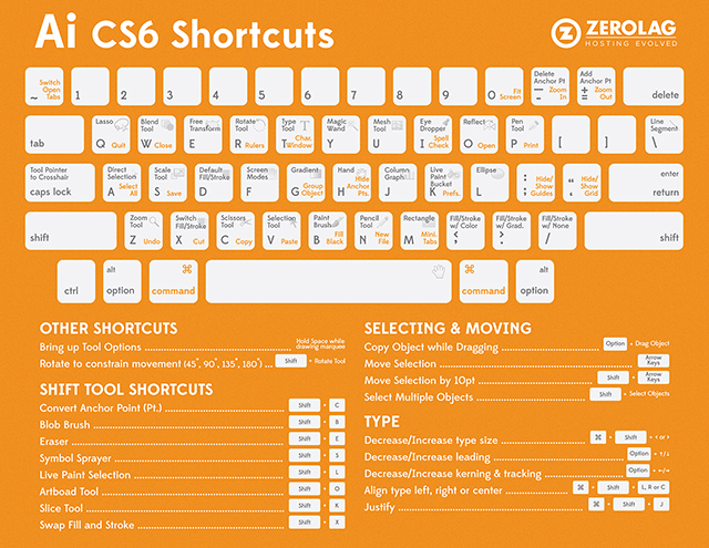
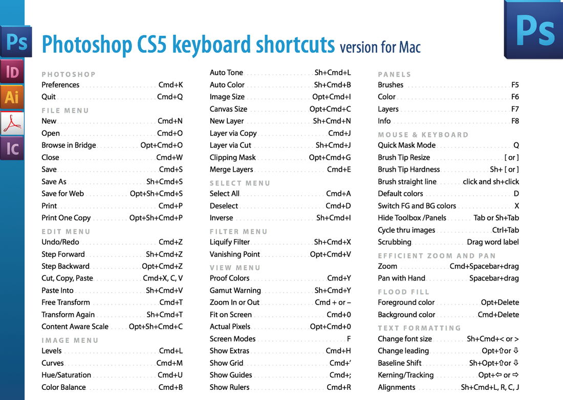
Identify / match critical tools and keyboard shortcuts from the following software programs:
a. Photoshop
b. Illustrator
c. InDesign
Photoshop
Illustrator
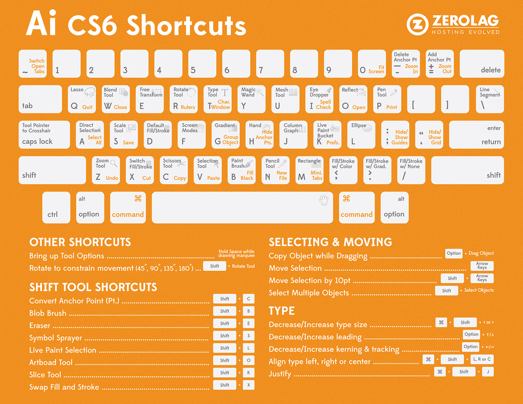
InDesign